Layouts Performance
Layouts are the core of working with Assembler Online in a quick and effective way. Layouts are predetermined content distributions which define what type of content should be dragged and dropped, whether image or text, and how that content will be visualized. Upon entering Assembler Online, users can navigate to the Layouts tab in the right sidebar and see the available Layouts. Once a layout has been chosen, users simply have to drag and drop it to the desired location in the template. If a layout is not filled in with any kind of content, it will not be displayed in the final rendition or HTML export.

The Layouts Menu
Once the layout has been created, they can be managed and modified with the layouts configuration menu, represented by a light blue frame which shows at its perimeter when users hover on it:


The two arrows on its side allow for the layout to be moved quickly by holding, dragging and dropping it to the desired position within the general structure. On the other hand, the three dots on the right side allow for a few more configuration options. When a user mouses over the three dots, they expand to show three new icons:
![]()

Clicking on the bin icon deletes the whole Layout section (row) from the screen. Clicking on the plus icon adds a column on the right of the layout. Clicking on the gear icon makes the menu bar, shown below, on the top of the screen popup.![]()

Columns
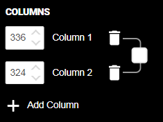
By clicking on the Columns icon, a window appears, allowing to modify columns’ appearance by modifying the numbers on the left to set widths, the bin icons to delete them or clicking the checkbox to make all columns the same size. Furthermore, by clicking on the “Add Column” dialogue, users can add any number of columns, creating personalized Layouts.

Padding
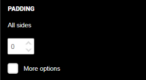
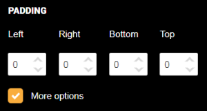
Padding refers to the space between the layout and its container, in this case the total width of the canvas. Padding can be adjusted either individually or generally with boxes such as the ones shown below.


Border weight and color
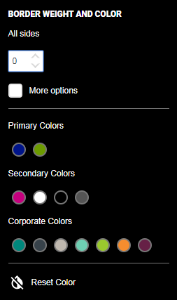
In the menu shown below, users can input a border weight (thickness) applying to all sides, and side by side by checking the “More options” box. Once the border weight has been established, users can select its color by checking one of the circular switches and choosing from primary and secondary brand colors or other corporate colors.

Background color
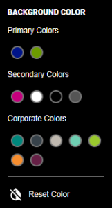
The background color in the icon shown above determines the background color for the container of the button in this case. In the menu below, users can once more select the desired color by clicking on one of the brand’s or corporate color switches.

Responsive Layout
Checking the Responsive Layout box automatically optimizes the column for mobile devices, allowing for better visualization of the final project.

