How do I adjust my Project for Mobile view?
All the layouts have the responsiveness activated and automatic by default. Consequently, on mobile devices the design will adjust to improve readability.
For example, columns will be positioned one below another in mobile view, despite the desktop view will have the columns one next each other, in the same line.
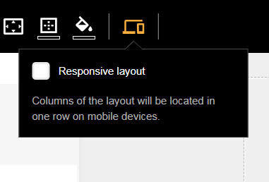
To de-activate the responsive function, mouse over the right side of the desired layout to show the blue frame with the layout options.
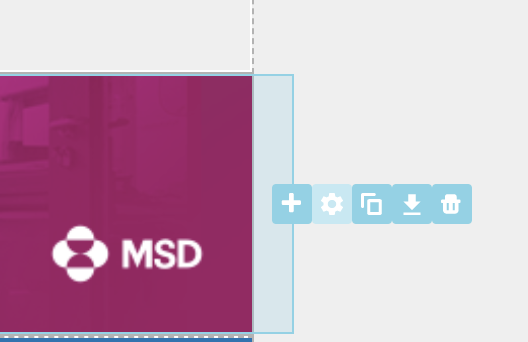
Press on the gear icon to trigger the layout toolbar. Then press on the responsive icon (laptop with phone). You can check or uncheck the mobile settings to make this specific layout non-responsive.
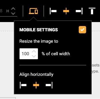
You can also adjust how the image or the alignment must adjust in the responsive view for mobile devices.