Cells Performance
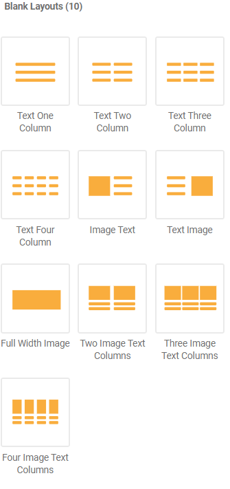
Every layout in Assembler Online is composed by predetermined blocks, as we saw in the main Layouts section. These blocks, namely Cells, are native Assembler Online drag-and-drop layouts which distribute content into columns, or in Assembler terminology, Cells. These content distributions can be seen in the Layouts tab of the right sidebar, under the Blank Layouts section.

The blank layouts can be dragged and dropped into the desired location, ready to be filled with content and modified. By hovering on the side of a layout, users will see a blue box defining its area, separated into the cells. In the example below, you can see the layout is built of two cells, where on the left the cell is prepared for image input, and the right one for text.


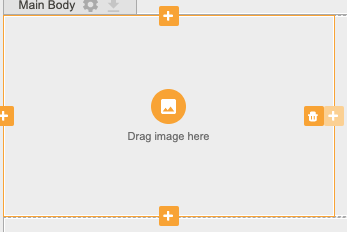
Upon hovering on a specific cell, users see its perimeter turn orange and two buttons appear. The bin icon is used to delete the cell: if a user deletes one of the cells of a two column layout, the remaining cell would occupy the fill width of the project.


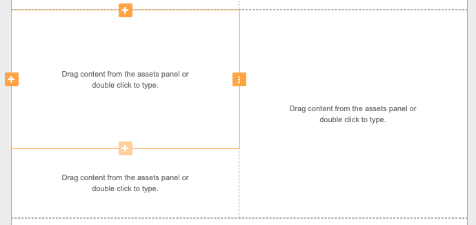
The plus icon, when clicked, would create a new cell on the right or left side, or above or below the highlighted one. This cell would occupy the same available horizontal or vertical space, but would consist of half the height of the original cell, as shown in the image below.

