Creating a Call To Action button
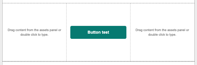
Drag and drop the Button element to the artboard
There typically are three predetermined button styles located on the assets panel under the Elements tab. Users can find them on the Elements section. The buttons are divided between sizes: Small, Medium and Large. Users can select and drag them onto the artboard by dragging and dropping the desired size.

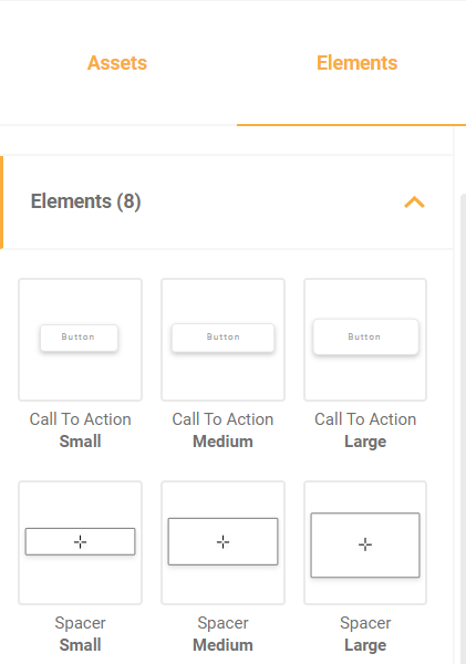
Users can modify the width of the buttons by clicking on the edges of them and stretch to the edges of the artboard.

Typing on a button and adding a URL
Users can input any desired text within the Call to Action by clicking twice on the placeholder text and typing a new one, along with applying styles with the text editor on top of the screen. To include a URL on the button, in the same text editor, users can highlight the text and click on the Insert link menu button (hyperlink icon). To add a hyperlink, simply type or copy and paste the URL on the dialog box and press enter.

Editing a Button

As well as the text and images, buttons have their proper editing menu. This intuitive menu will help users to quickly design buttons which will align to all email requirements and be fully responsive. Here are all the options available on the menu.
Button Alignment
Align the button horizontally and/or vertically with regards to the available space in the “container”.

Adjust to cell
Change the button’s size to fill all the available horizontal and vertical space edge to edge.

Font family
The font family determines the typography of the text. The dropdown menu will first show the fonts established in the template according to branding guidelines, followed by other fonts. Choose the appropriate font family among the available fonts in Assembler Online and click on it to apply it to the selection.


Font Size
Font size determines the height and width of the selected text.


Bold/italic/underline
By clicking on the three icons, users can add boldness, italics and underlining to the text of buttons, even when a predetermined style has been previously applied.


Text Color
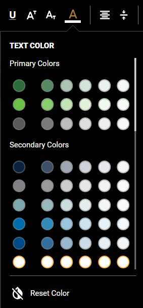
The text color dropdown shows three sections with the primary and secondary colors established in the template according to branding guidelines, as well as our company’s corporate colors. Simply click on one of the color switches to apply it to the selected text.

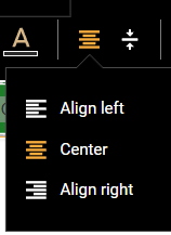
Text Alignment
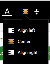
By clicking on the two separate options, users can change the alignment of the text inside the button, horizontally and/or vertically with the relation to the button itself.


Internal Padding
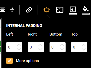
Users can modify the button’s padding. Padding is the space between the text and the “container” element, in this case the button’s edges. It can be selected with regards to every edge (Left, Right, Top and Bottom), or generally for the whole container by unchecking the “More Options” checkbox.

External Padding
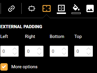
Users can also modify the button’s external padding. External padding refers to the space between the button and its container, in this case the cell in the chosen layout. As internal padding, it can be adjusted either individually or generally with boxes such as the ones shown above.

Border weight and color
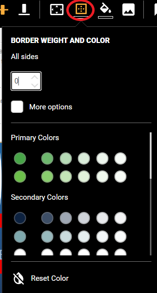
In the menu shown below, users can input a border weight (thickness) applying to all sides, and side by side by checking the “More options” box. Once the border weight has been established, users can select its color by checking one of the circular switches choosing from primary and secondary brand colors or other corporate colors.

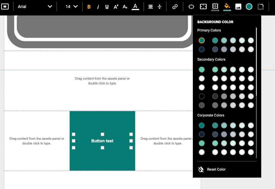
Background color
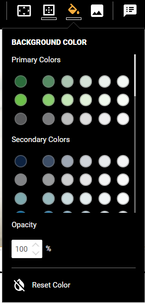
The background color in the icon shown above determines the background color for the container of the button in this case. In the menu below, users can once more select the desired color by clicking on one of the brand’s or corporate color switches.

Button color
In the full circular icon, users can finally decide the color of the button itself, once again choosing from the brand’s primary and secondary colors as well as the corporate colors.

