Image Components
Include images before starting a project
Users can bring image components from PromoMats to their Assembler’s project, before starting it or at any point in the editing process. Users can simply add them to the favorites list or shopping Cart by pressing on the star icon or the cart icon next to the Image title.![]()

We also recommend, if collaborating with other colleagues, to relate it to your Material. From the material’s full view, in the right panel, go to “Related Components” section and press the add button. In the Pop Up window, they can select the images to be related from their “Favorites” dropdown at top, to easily find them.
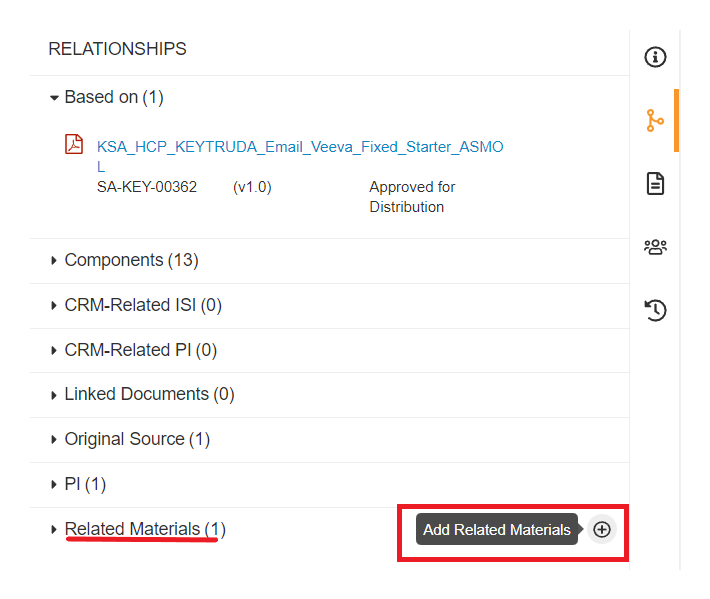
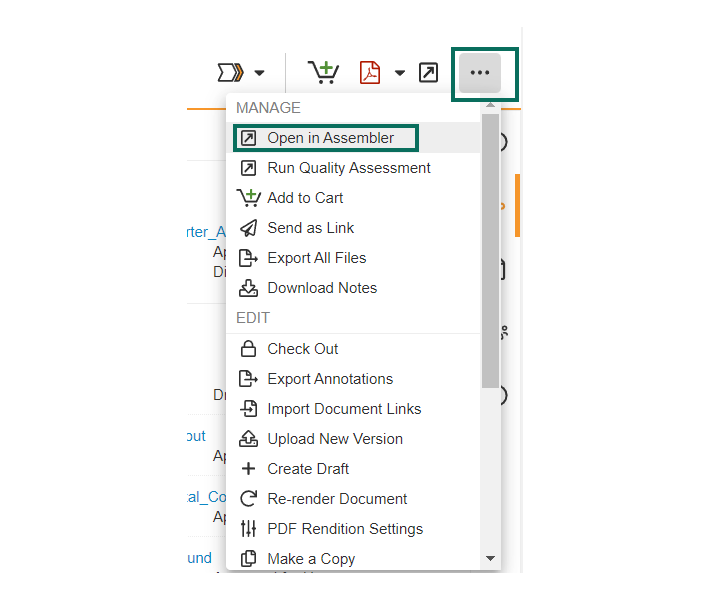
Once our images are selected from PromoMats, we can “Open in Assembler” from the main action wheel icon, at top right of our Material.
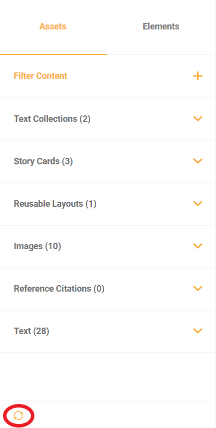
Our Assembler project will open in a new tab on our browser. The Assembler project will show under Assets, all the selected images from PromoMats.
If a new image is selected in PromoMats, we just need to click on the Refresh button, at the bottom of the Asset Panel
Include images directly through Assembler Online
Users can include images saved on your shopping cart, favorites and related materials into their Assets panel by clicking on the “Filter Content” section. Expand the dropdown to display the available options and choose the sources from where Assembler should import the content.
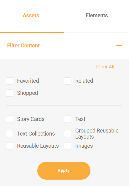

Once the desired sources are checked, press the refresh (![]() ) button located on the bottom of the Assets panel. The images will now be viewed and available for use on the Assets panel.
) button located on the bottom of the Assets panel. The images will now be viewed and available for use on the Assets panel.
Include images from desktop
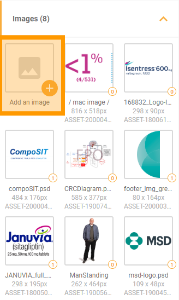
To include images from your local storage into the artboard, select the Assets tab on the right sidebar and expand the Images dropdown. In the dropdown, the first option shown is “Add an image”, where upon clicking a popup will be displayed.

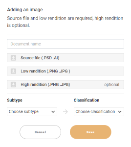
The popup will give instructions on the requirements, stating that the source file, as well as a low rendition of the image, are required. First, upload the source file (.psd or .ai) by clicking on the grey “source file” box. The name of the document will be generated automatically. Repeat the same process for the low rendition in the corresponding box. This low version would be the .png or .jpeg version of the source document, with a reduced size. You can also include an optional high rendition image by pressing on the high rendition box.
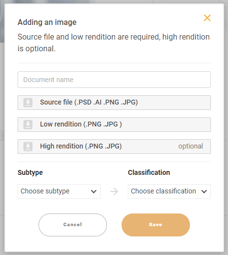
The last step is including the subtype and the classification by clicking on the dropdown menu. Typically, the subtype should be “Image” or “Logo” (depending on the type of image uploaded), while the classification would depend on the style of the image, for example drawing/illustration.
Dropping images from Assets panel to the artboard
To include images into your artboard, go to the right panel and select Assets. Expand the image section by clicking on it, after which all the images in the project will be shown. To add an image to the project, simply click on one of them, drag it over the desired location and drop it to add it to the section.
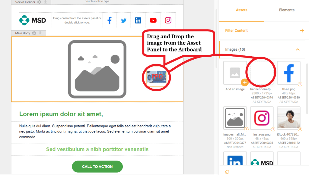
Image edition
To edit an image’s properties, double click on the image, where the toolbar will pop down from the upper side of the screen.

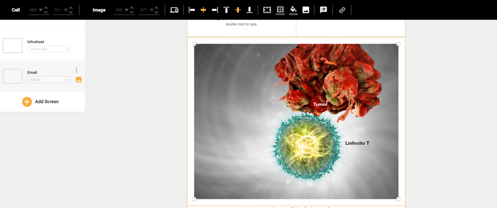
The options of the above toolbar are, in order, as follows:
Mobile settings:
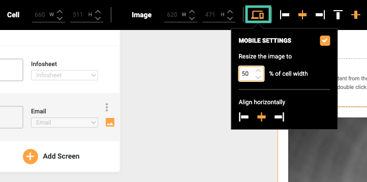
This option allows you to modify how the image will look on a mobile device, making it possible to: resize the image on the cell width and align it to the left, right or center of the cell.
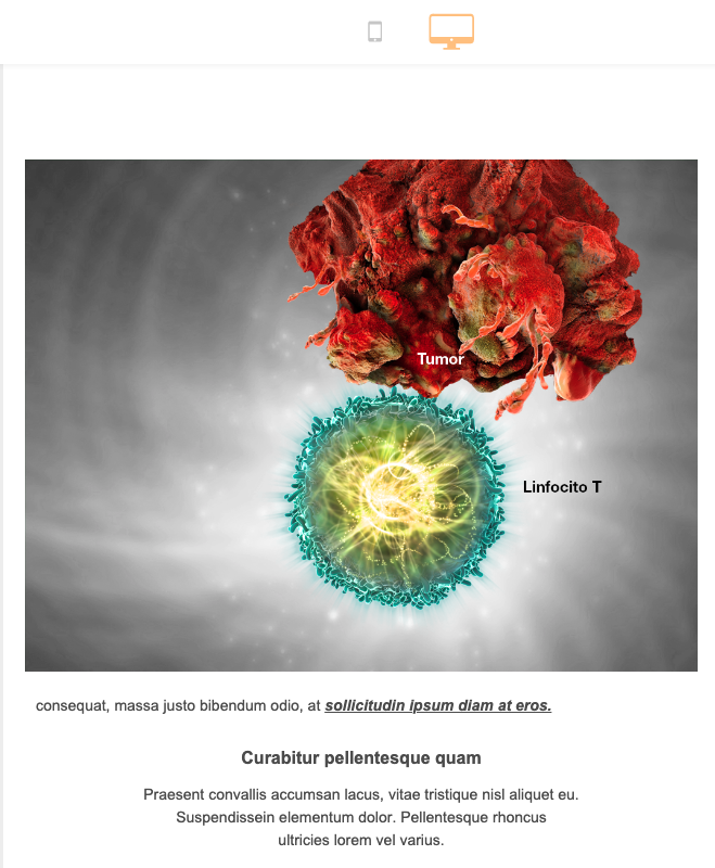
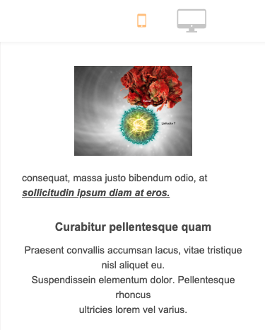
An example of the performance in mobile and desktop version when resizing an image is shown down below:
Align to the left:

Aligns the image horizontally to the left side of the container.

Align to the center:

Aligns the image horizontally to the center of the container.

Align to the right:

Aligns the image horizontally to the right side of the container.

Align to the top:

This option is more useful in multi-column layouts, where any column other than the image is taller than the image. By clicking this option, the image will be vertically aligned to the top of the container.

Align to the middle:

This option is more useful in multi-column layouts, where any column other than the image is taller than the image. By clicking this option, the image will be vertically aligned to the middle of the container.

Align to the bottom:

This option is more useful in multi-column layouts, where any column other than the image is taller than the image. By clicking this option, the image will be vertically aligned to the middle of the container.

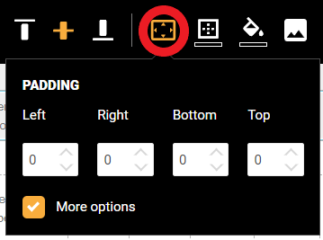
Padding
Padding refers to the space between the image and its container, in this case the cell in the chosen layout. Padding can be adjusted either individually or generally with boxes such as the ones shown below.

Border weight and color
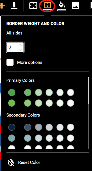
In the menu shown below, users can input a border weight (thickness) applying to all sides, and side by side by checking the “More options” box. Once the border weight has been established, users can select its color by checking one of the circular switches choosing from primary and secondary brand colors or other corporate colors.

Background color
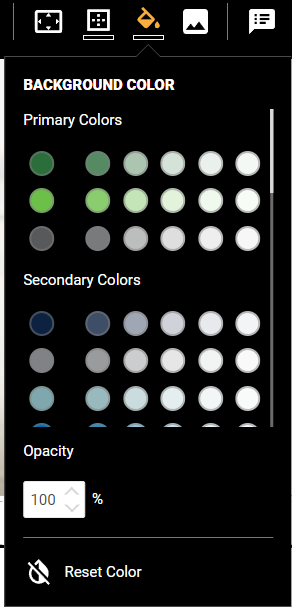
The background color in the icon shown above determines the background color for the container of the image in this case. In the menu below, users can once more select the desired color by clicking on one of the brand’s or corporate color switches.

Adding a URL
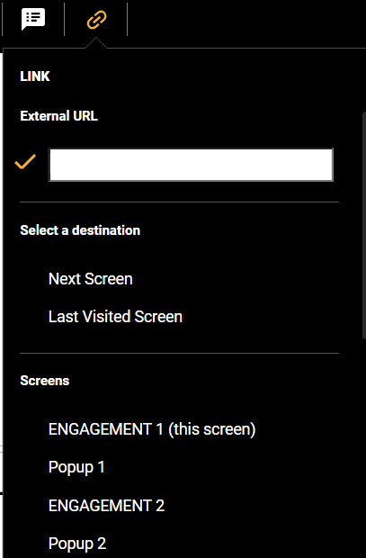
To include a URL on the image, users can click on the Insert link menu button (hyperlink icon). To add a hyperlink, simply type or copy and paste the URL on the dialog box and press enter.

SOURCE Rendition: Why do we need a PSD or AI?
If you have the original file is always better in order to modify or create new materials.
Please ask your agency or creative team about the files.
Hi and Lo renditions:
The HI and LO renditions are used for assembler and the final files.
The LO will be used in digital materials as Email and the HI in iPads
Sizes of the images
The images should be adjusted to the final material they will be used.
For example, an email need small size images in order to be able in the email clients using mobile networks. The optimization of these pictures is very important.
Here we will talk about the most important points on those images.
Please feel free to share with your creative team or agency if they have any question about it or just keep in mind these pieces of advice when you request or create a new piece of content.
HI and LO renditions size
The recommended size for the full screen pictures for iPad is:
- HI 2048 w x 1536h
- LO 1024 w x 768 h

This could be applied to all the horizontal pictures then. You can always use in full screen mode.
The recommended size for the full screen pictures for Email are:
- HI 1536 w x 1536h
- LO 768w x 768h
In this case the images could be smaller depends on the use (e.g. a logo could be 400 pixel width if that is the biggest size it will be used on the emails)
Right records
Remember to have the reproduction and copyright records if needed in your market in order to set them up in PM